
Business need
- Understand team progress
- Identify workload issues
- Reduce manual reporting
- See patterns, not noise
Product design SaaS 2026
TimoDesk turns work activity across desktop and browser environments into useful reporting for distributed teams—without making people feel watched.
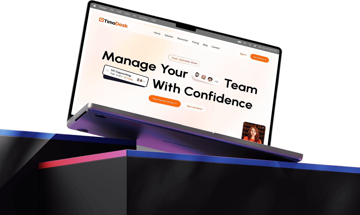
Project
The real design problem was not tracking time. It was helping managers understand progress while giving employees clarity and autonomy around the information being captured.
The problem
Business need
Human need
01 — Discovery
Research considered company owners, team managers, remote employees, and freelancers.
I focused on existing behaviour rather than feature requests: how teams understand progress today, where manual reporting breaks down, and when tracking starts to feel invasive.
Key insight
Managers did not need more data. They needed faster answers. Employees were less concerned about tracking itself than uncertainty around it.
Dashboards should answer “does this need attention?” before exposing every metric.
What is captured, when it is active, and who can access it must be understandable in-product.
Automation should reduce “work about work” without removing the ability to review and adjust.
How might we
Give managers enough visibility to make better decisions while giving employees enough transparency to feel in control?
02 — Product principles
Remove constant timers, recreated activities, and manual reports.
Turn raw activity data into quick, understandable information.
Give people a clear view of their own tracked information.
Start with team patterns; reveal individual detail only when necessary.
03 — Dashboard direction
The early direction gave equal weight to screenshots, app usage, working hours, and individual activity. It looked powerful, but made prioritisation difficult and pulled the experience toward surveillance.
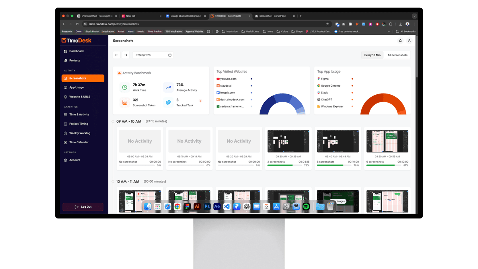
04 — Designing transparency
Employees should not be passive subjects of a system collecting work activity. Making their own information visible changed the relationship from “the company has data about me” to “this is what the system records about my work.”
05 — Visual language
The identity combines a clock and a completion checkmark: a simple expression of understanding how time turns into progress. The interface uses generous spacing, direct language, and calm data visualisation to reduce pressure in a traditionally intrusive category.
06 — Outcome
A product foundation designed for live learning and iteration.
Activity is captured without asking people to reconstruct their day.
Reports are organised around questions rather than data structure.
Sensitive monitoring features remain supporting evidence, not the default view.
A clear visual system supports continued testing and product iteration.
The lasting lesson: when user needs seem to conflict, redesign the system so they do not have to compete.
Explore more selected work