
Managers
TimoDesk / Product Design / SaaS / 2026
Visibility Without
Surveillance
Designing time tracking that gives managers visibility without making employees feel watched.
- Role
- Lead Product / UI/UX Designer
- Scope
- Product thinking · Research · UI/UX · Design system · Branding
- Users
- Business owners · Team managers · Employees · Freelancers
- Platform
- Web application · Desktop tracking experience · Mobile app
- Timeline
- 5 months
The challenge
The problem was not tracking time.
It was what tracking does to trust.
Too little visibility

The balance
Employees
Too much monitoring
Employees feel watched
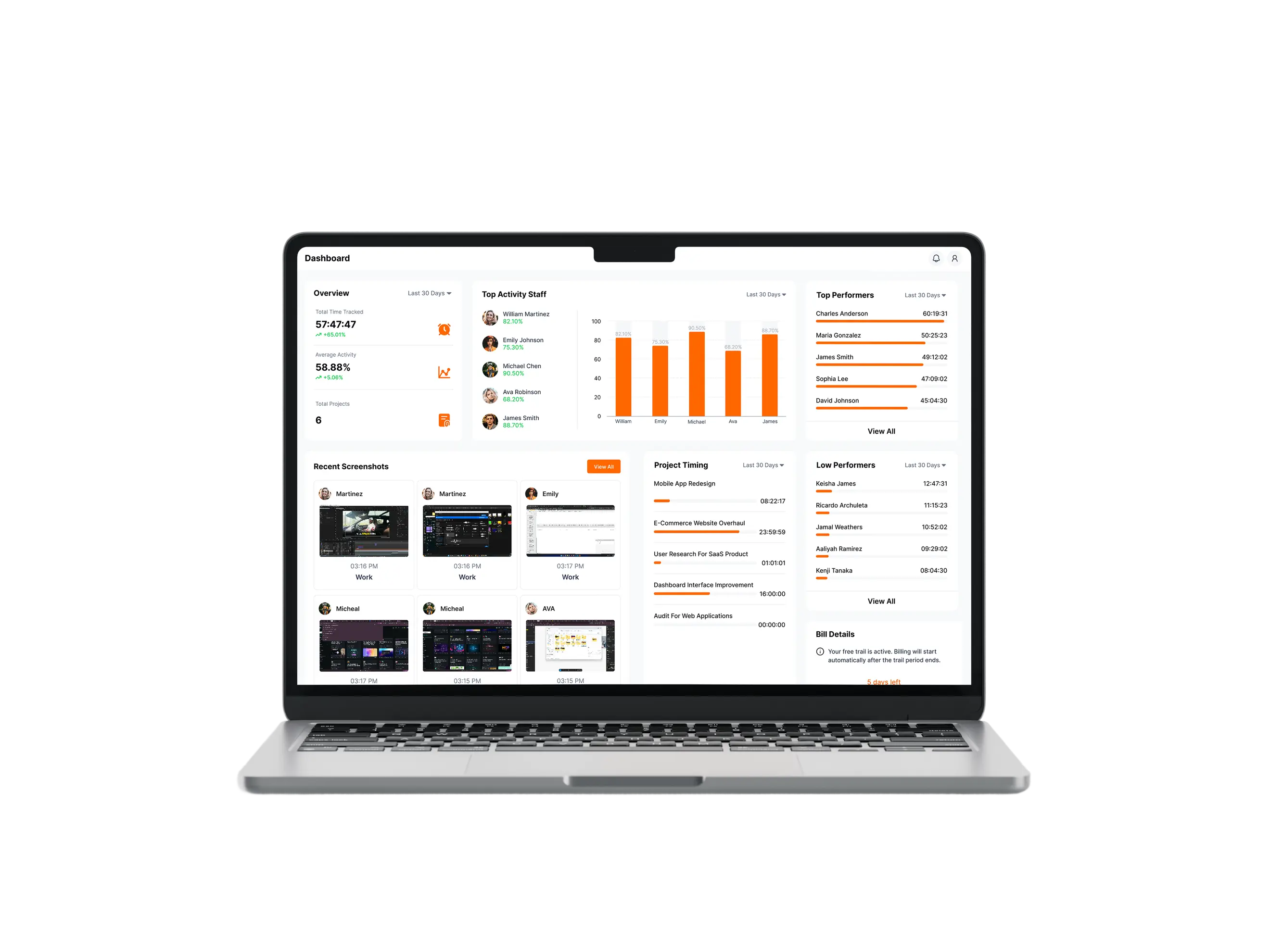
The challenge wasn’t collecting more data. It was deciding what information actually deserved to be visible.
Manager needs
- Where is the team’s time going?
- Is work moving as expected?
- Where are projects slowing down?
- When does something need attention?
Employee concerns
- What exactly is being captured?
- When is tracking active?
- Who can see my activity?
- Can I fix what’s recorded?
The balancing act
How might we give managers useful visibility while keeping employees informed and in control?
Discovery
I started by looking at the problem from both sides.
I focused on real behaviour: how managers understood progress, what information they relied on, where reporting broke down, and when tracking began to feel invasive.
Do you need a quick view of team productivity?
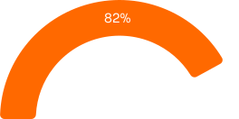
Business owners
Needed a clear view of productivity without checking every employee.
Do you need more detail on workload or attendance?
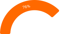
Team managers
Needed enough detail to spot workload, attendance, and productivity issues.
Do you want to know what employers can see?
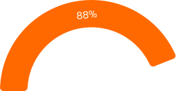
Remote employees
Wanted clear expectations and transparency around what employers could see.
Would automatic tracking reduce manual effort?
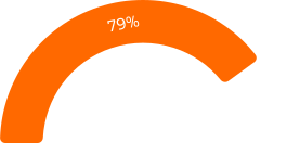
Freelancers
Wanted automatic tracking without interrupting their actual work.
Key insight
Managers did not need more data.
They needed faster answers.
Managers needed to move from “What happened?” to “What needs my attention?” Employees needed clarity on what was tracked, when tracking was active, and who could see it.
For managers
Turn data into decisions.
For employees
Make tracking clear and understandable.
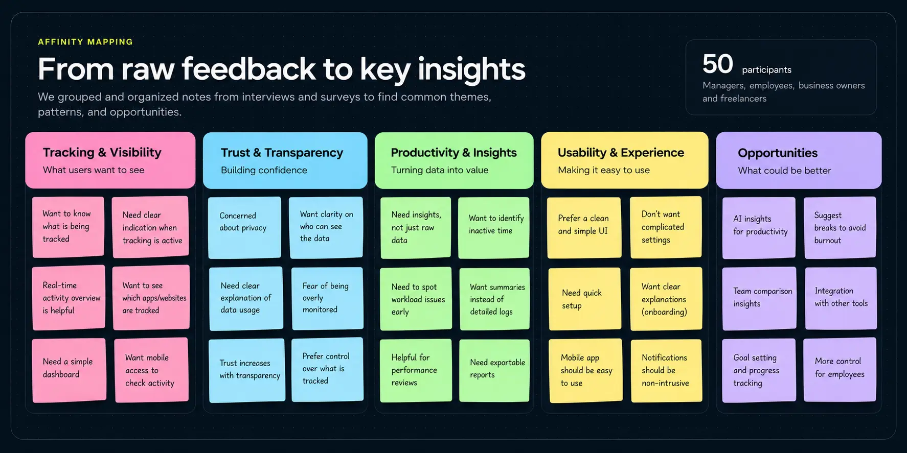
Product direction
Design for insight,
not control.
Decision before detail
Answer whether something needs attention before exposing every available metric.
Make tracking visible
People should know when tracking is happening and what information exists about them.
Automate the repetitive
Remove constant timers, reconstructed activities, and manual reporting while preserving review and correction.
Reveal detail progressively
Start with team patterns and move into individual evidence only when deeper investigation is necessary.
Early direction
We had the data hierarchy backwards.
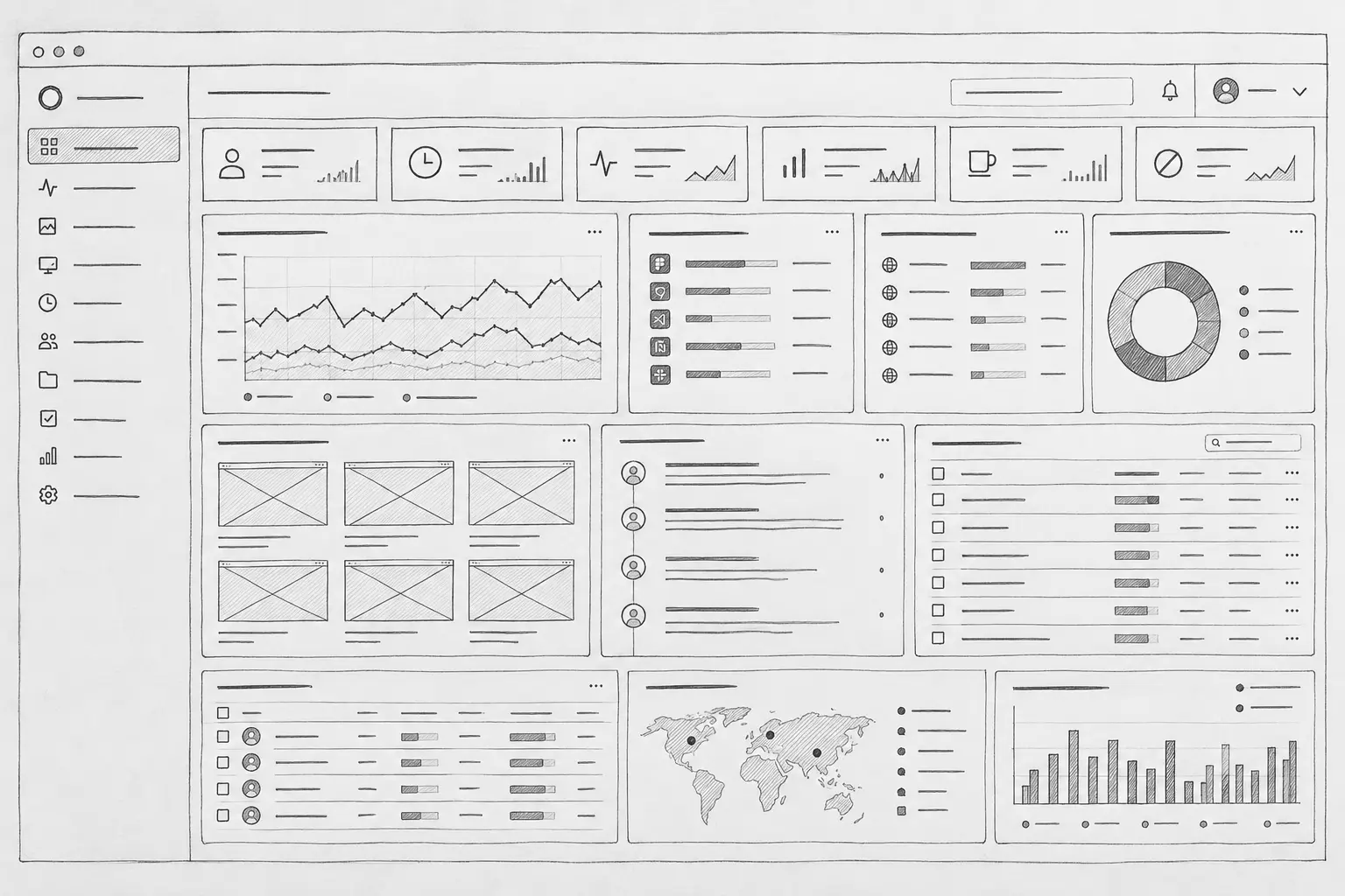
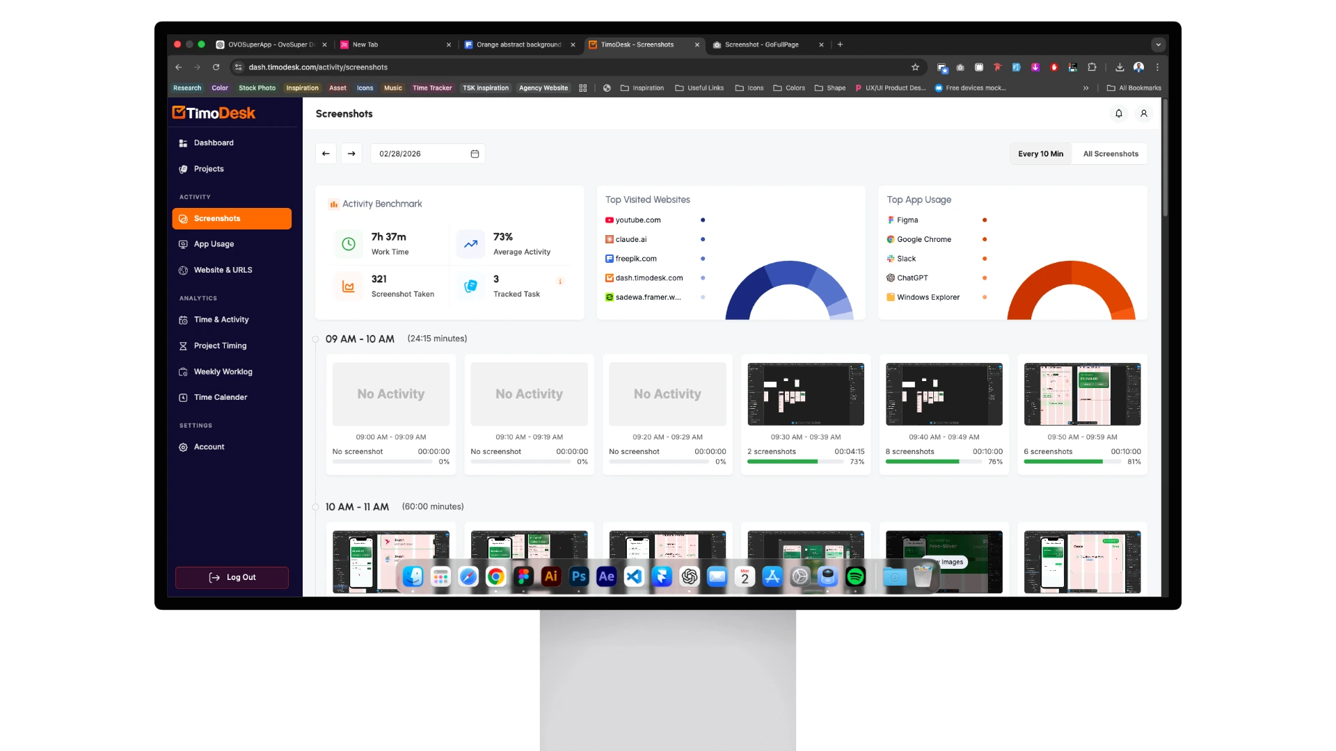
My first instinct was to show everything. Early dashboard explorations gave screenshots, application usage, working hours, activity, and productivity metrics similar visual priority.
01
Surveillance-heavy dashboard
Screenshots and individual activity were too prominent, so I moved them deeper into the experience.
02
Maximum information density
Fitting every metric above the fold reduced navigation but increased interpretation, so summary came before detail.
03
Flat information hierarchy
Giving every metric equal visual priority made the dashboard harder to scan, so I grouped information by decision priority.
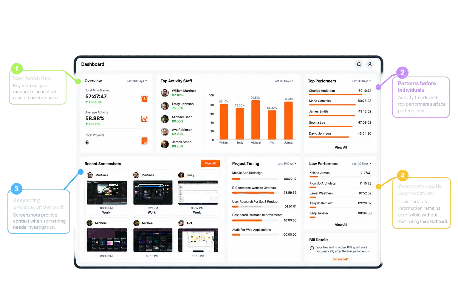
Monitoring is supporting evidence. It is not the product’s information architecture.
Core design decision
From every metric to the next decision.
Instead of asking what data TimoDesk could show, I asked what a manager should understand within the first 30 seconds.
- 01
Overall work state
Establish the current condition before asking people to interpret detail.
- 02
Changes and exceptions
Surface the moments that may require attention.
- 03
Team-level patterns
Provide context before moving toward an individual.
- 04
Individual evidence
Reveal sensitive detail only when deeper investigation is necessary.
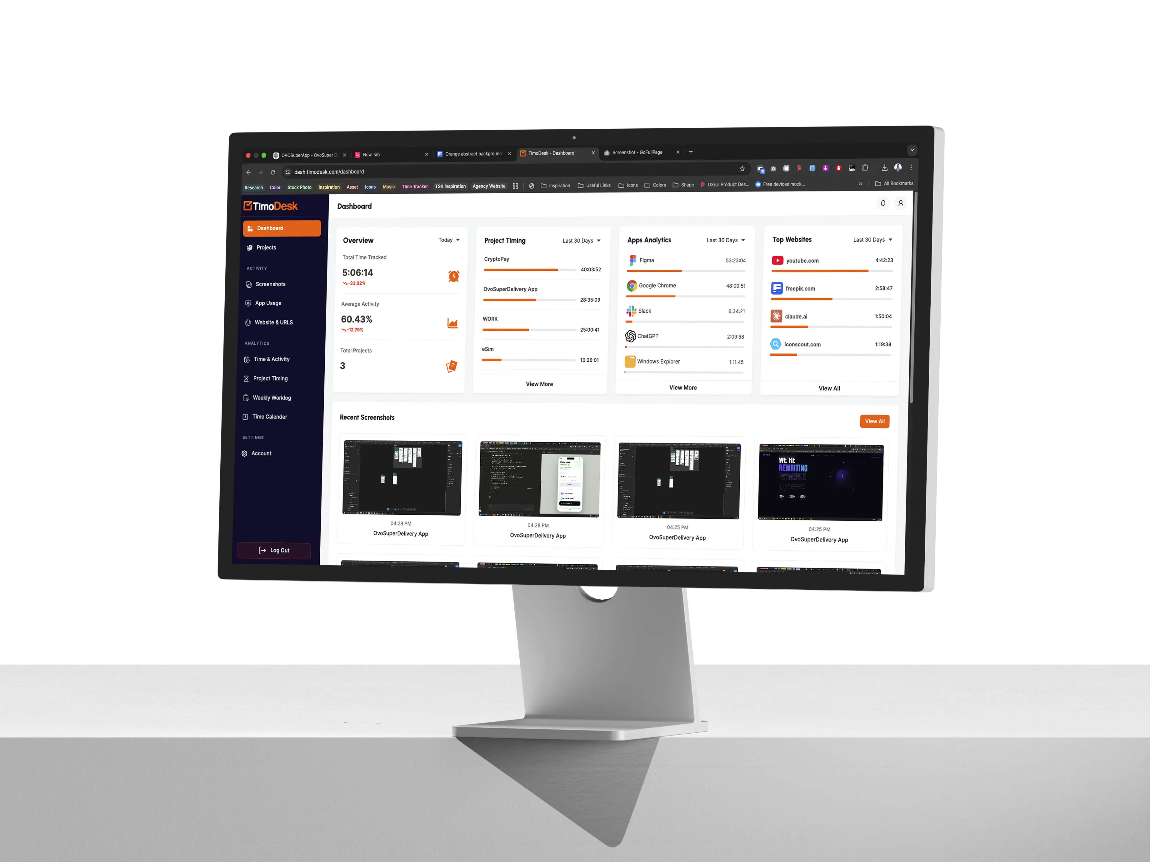
Employee-side transparency
People being tracked should not feel like passive subjects.
Making employees’ own information visible changed the relationship from “the company has data about me” to “this is what the system records about my work, and I can see it too.”
Tracking state
Is tracking currently active?
Captured activity
What has the system recorded?
Shared visibility
What information is visible to managers?
Correction
What happens when activity needs to be reviewed or adjusted?
Core workflow
Capture automatically.
Explain clearly.
Investigate only when necessary.
Capture
Automatic
working-time and activity recording
Understand
Reports, timelines, project breakdowns, and activity patterns
Investigate
Detailed evidence when deeper accountability is required
Imperfect conditions
A tracking product has to earn trust when things go wrong.
Tracking does not happen in perfect conditions. Interruptions and unclear system behaviour can make recorded activity feel unreliable, so these moments need explicit, understandable states rather than silent failure.




Visual system
Make monitoring feel informative, not intrusive.
TimoDesk pairs precise productivity data with friendly visuals, clear patterns, and plain language so monitoring feels understandable, not invasive.
Generous spacingClear hierarchyDirect languageCalm data visualisation
Design system
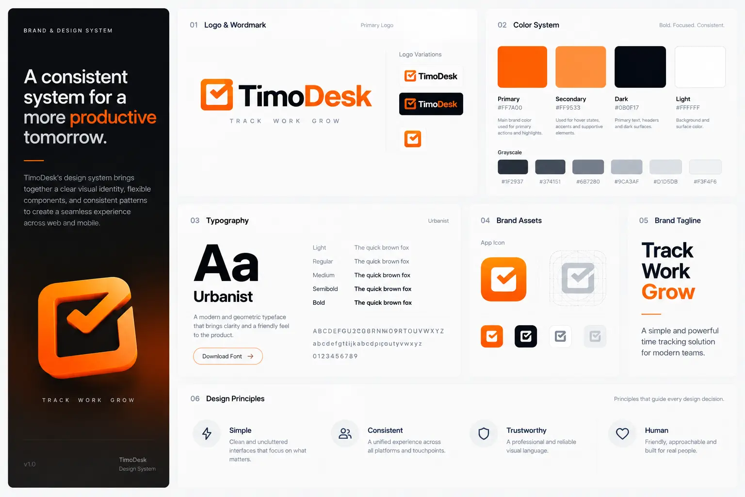
Consistency mattered because the product had to explain a lot of states.
Branding
Time
turns into
progress.
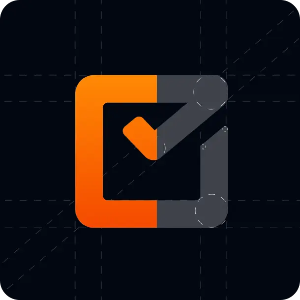
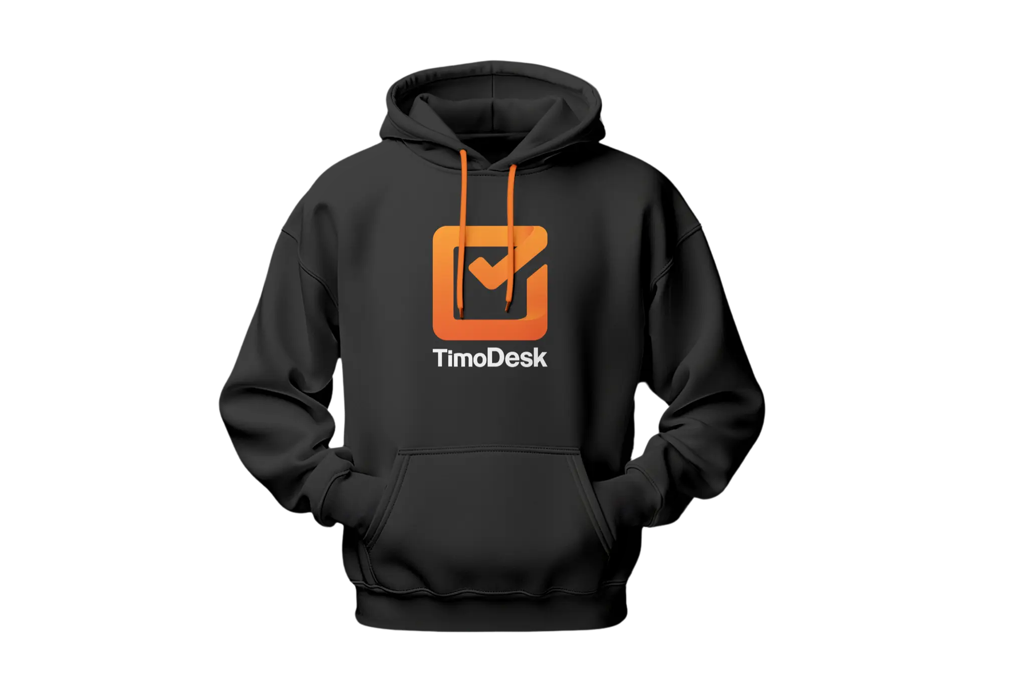
The clock signals time. The checkmark signals progress. Together, they make tracking feel productive, not invasive.
Product trade-offs
The strongest solution was not choosing one side.
Visibility vs privacy
Managers retained access to detailed evidence, but aggregated productivity information came first.
Automation vs control
Automatic capture reduced manual effort, while review and correction kept people in control of their records.
Overview vs detail
Progressive disclosure created a path from team patterns to individual evidence only when needed.
Data vs decision speed
Reports were organised around common questions instead of the structure of the underlying data.
Can the product structure make both needs coexist?
Outcome
A clearer way to understand work.
TimoDesk evolved from a traditional employee-tracking concept into a productivity platform built around visibility, transparency, and understandable reporting.
Activity is captured without relying on constant manual logging.
Reports are organised around questions and decisions.
People can understand the information being captured.
Sensitive evidence supports investigation instead of dominating the experience.
The visual system provides a foundation for continued testing and iteration.
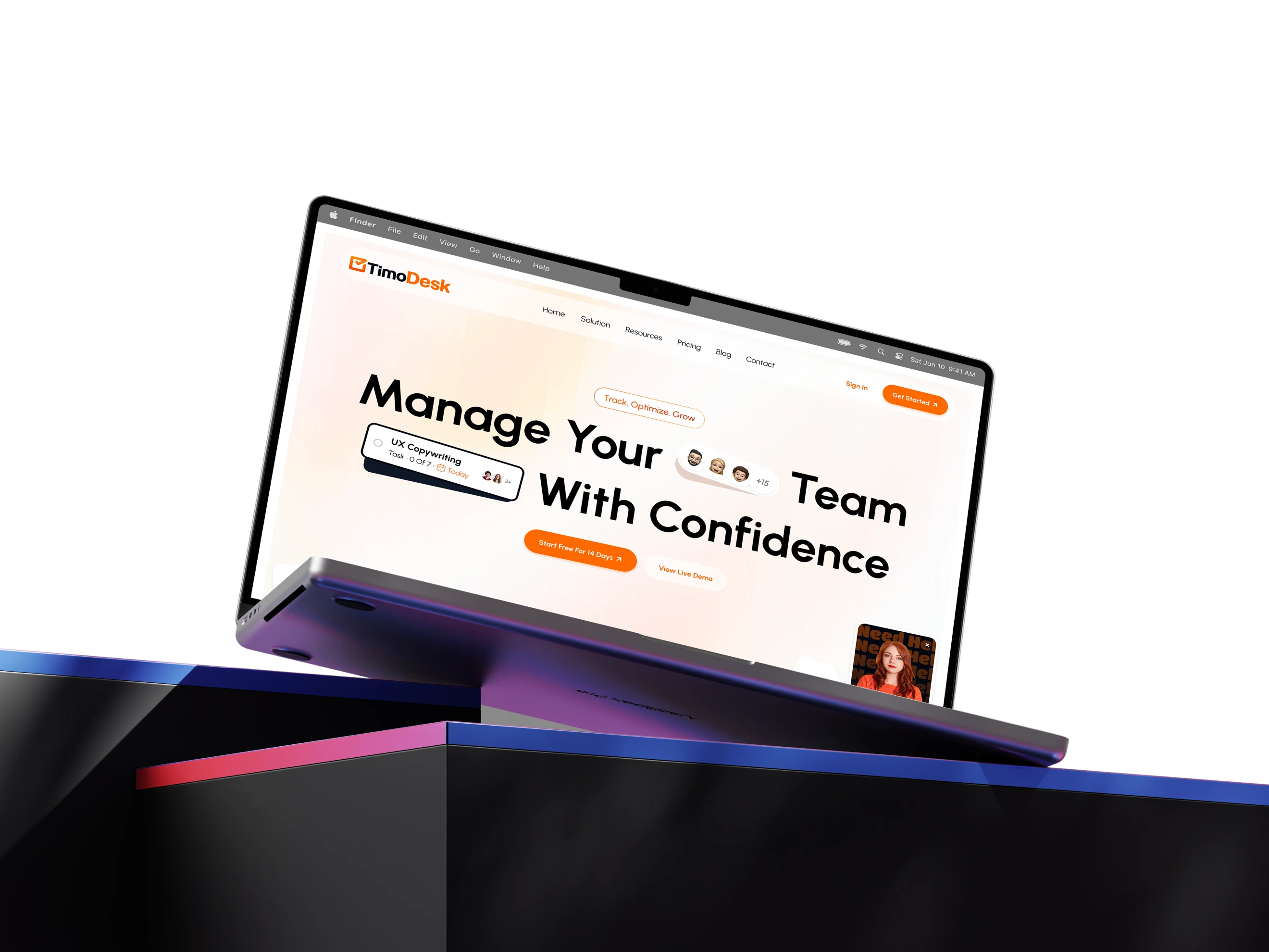 View live product
Reflection
When user needs appear to conflict, redesign the system before choosing a side.
Managers wanted more visibility. Employees wanted more autonomy. The obvious solution would have been to compromise somewhere in the middle.
Automation helped managers receive information while removing manual work from employees. Transparent tracking gave businesses activity data while giving employees visibility into that same information. Progressive disclosure preserved access to detail without making surveillance the centre of the experience.
Good product design does not always balance competing needs. Sometimes it changes the system so they no longer have to compete.