Kothay.app · Field Force Management
Redesigning
field
operations for speed, clarity
and control
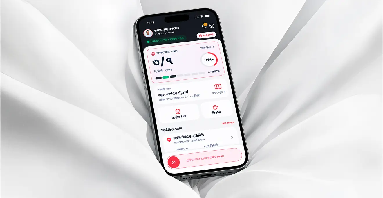
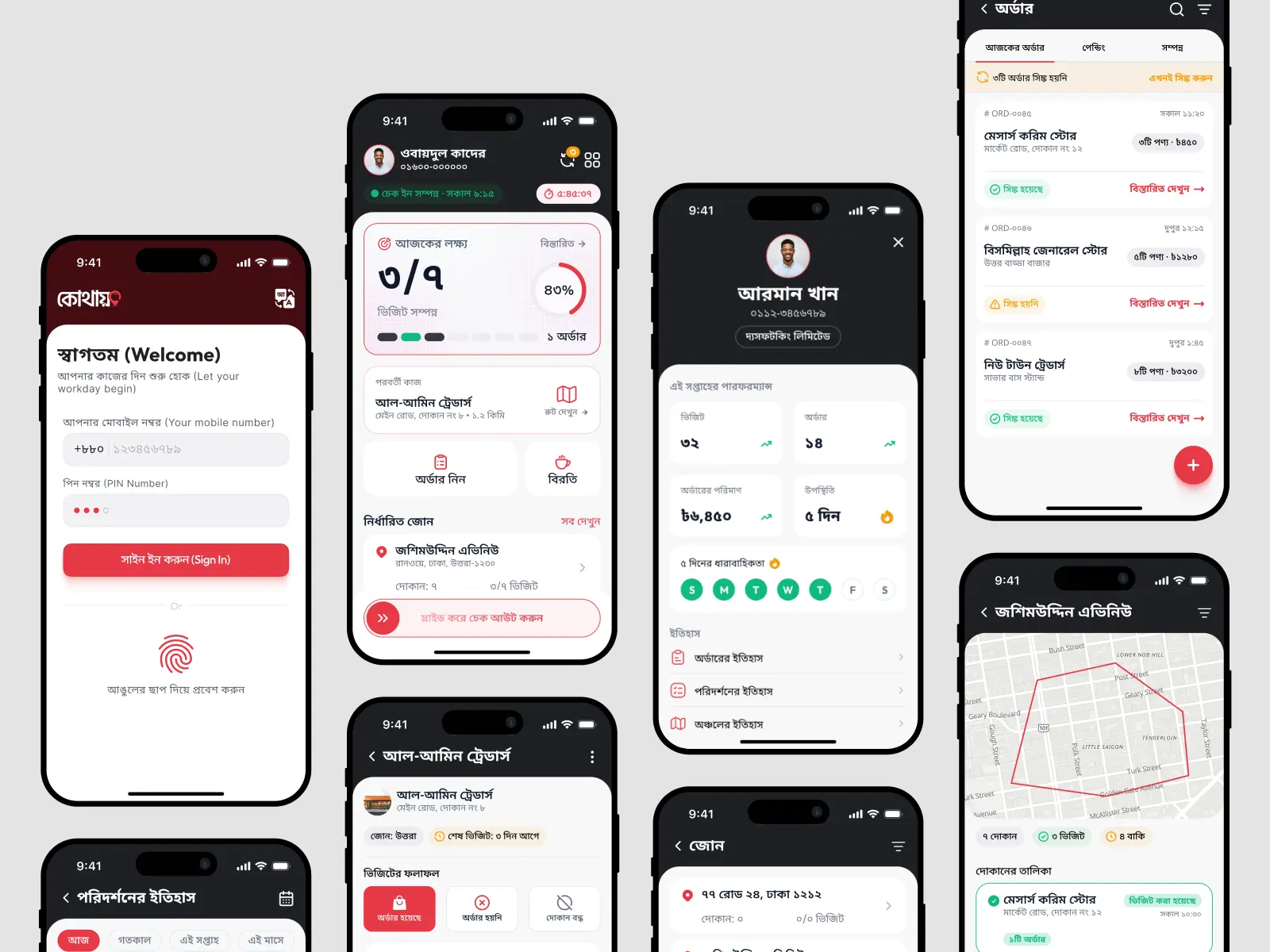
Kothay helps field sales teams manage check-ins, assigned zones, shop visits, orders, breaks and checkout while working away from a desk. I redesigned the experience around the reality of outdoor field work, where speed, visibility and clear next actions matter more than interface decoration.
- UX Strategy
- Product Design
- Interaction Design
- Information Architecture
- Outdoor Usability
- Bangla-first UX
- Offline & Sync States
- Design System
30 sec case study
Kothay in 30 seconds
Short on time? Hear the thinking behind the redesign before diving into the full case study.
View transcript
Kothay is a field-force management app used by sales teams working throughout the day in outdoor environments. The previous experience exposed too many features at once, while workers actually needed clearer answers to three things: how far they were through their day, where they needed to go next, and what action they should take.
I redesigned the experience around workday progress, routes, contextual actions, Bangla-first usability, outdoor visibility, and unreliable connectivity.
The result is a clearer field-work experience built around the worker’s actual day rather than the software’s feature structure.
কোথায় হলো মাঠপর্যায়ের বিক্রয়কর্মীদের জন্য একটি কাজ ব্যবস্থাপনা অ্যাপ। বাইরে কাজের দীর্ঘ দিনে আগের অভিজ্ঞতায় একসঙ্গে অনেক ফিচার দেখা যেত। অথচ কর্মীদের দরকার ছিল তিনটি স্পষ্ট উত্তর: দিনের কাজ কতটা এগিয়েছে, পরের গন্তব্য কোথায়, আর এখন কী করতে হবে।
আমি নতুন অভিজ্ঞতাকে সাজিয়েছি কাজের অগ্রগতি, রুট, প্রাসঙ্গিক পদক্ষেপ, বাংলা ভাষা, রোদে সহজে পড়া এবং অনিয়মিত ইন্টারনেট সংযোগকে কেন্দ্র করে।
ফলে অ্যাপটি ফিচারের তালিকা নয়, কর্মীর বাস্তব কর্মদিবসকে সামনে রেখে পথ দেখায়।
01 / Context
A workday managed from a phone
Kothay is a field-force management platform used by teams that spend most of their day away from a desk.
A typical salesperson may need to check in, review assigned locations, travel between shops, record visits, collect orders, take breaks, monitor daily targets and check out at the end of the shift.
The product already supported those operations. The opportunity was not adding more features. It was making the existing workflow easier to understand and faster to operate in real-world conditions.
- Check In
- Review Target
- Choose Zone
- Visit Shop
- Record Outcome
- Take Order
- Continue Route
- Break
- Resume
- Check Out
02 / Challenge
The interface worked. The environment made it harder.
Field workers do not use software under ideal conditions.
They may open the app while walking, standing outside a shop, navigating traffic, talking to customers or checking information under direct sunlight.
That changes what good UX means. A screen that feels understandable at a desk can become slow and difficult when attention is divided.
The redesign needed to answer
- Where am I in my shift?
- How much work have I completed?
- Where should I go next?
- What happened at previous locations?
- Has my work been recorded and synced?
- Bright sunlight
- Movement
- Repeated actions
- Limited attention
- Unreliable connectivity
03 / Audit
The original experience was feature-driven
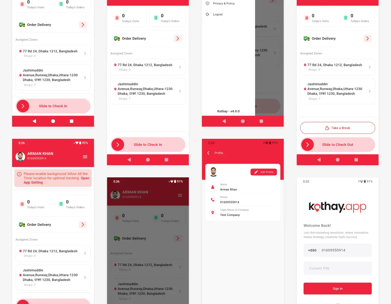
The previous application contained the functionality field teams needed, but its information architecture behaved more like a traditional business application.
Visits, orders, delivery, zones and account controls appeared as separate product features. Users still had to mentally combine those pieces to understand the state of their workday.
Weak workday hierarchy
Home surfaced features, but not the user's current state, progress or next action.
Progress required interpretation
Visits and orders appeared mainly as counters, not progress toward a daily goal.
Navigation carried operational tasks
Sync and history depended heavily on navigation rather than appearing in context.
Outdoor use was not the constraint
Long copy and weaker hierarchy demanded more visual attention than field work allows.
Design goal
Reduce the distance between opening the app and knowing what to do.
I reframed Home from a dashboard of features into an operational control surface for the workday. Every major decision was evaluated against four principles.
Glance, don't study
Important information should be understandable in seconds.
Show what happens next
The product should reduce the effort required to decide the next action.
Fast for frequent. Deliberate for consequential.
Routine actions stay easy. Higher-consequence actions require clearer intent.
Connectivity is a state, not an error
Users should understand whether work is saved, pending or synced.
04 / Iteration
From dashboard to field assistant
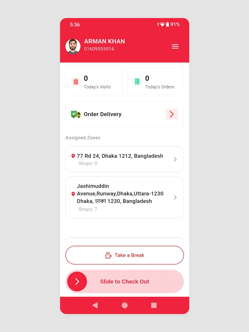
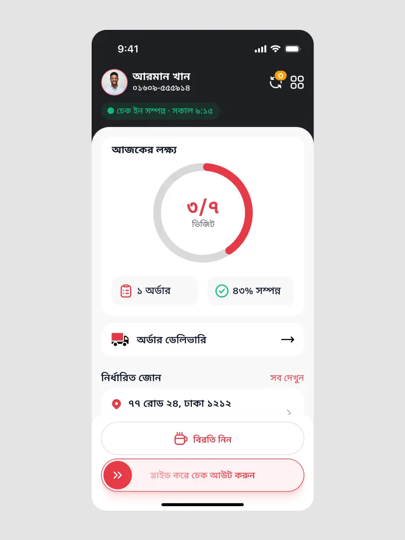
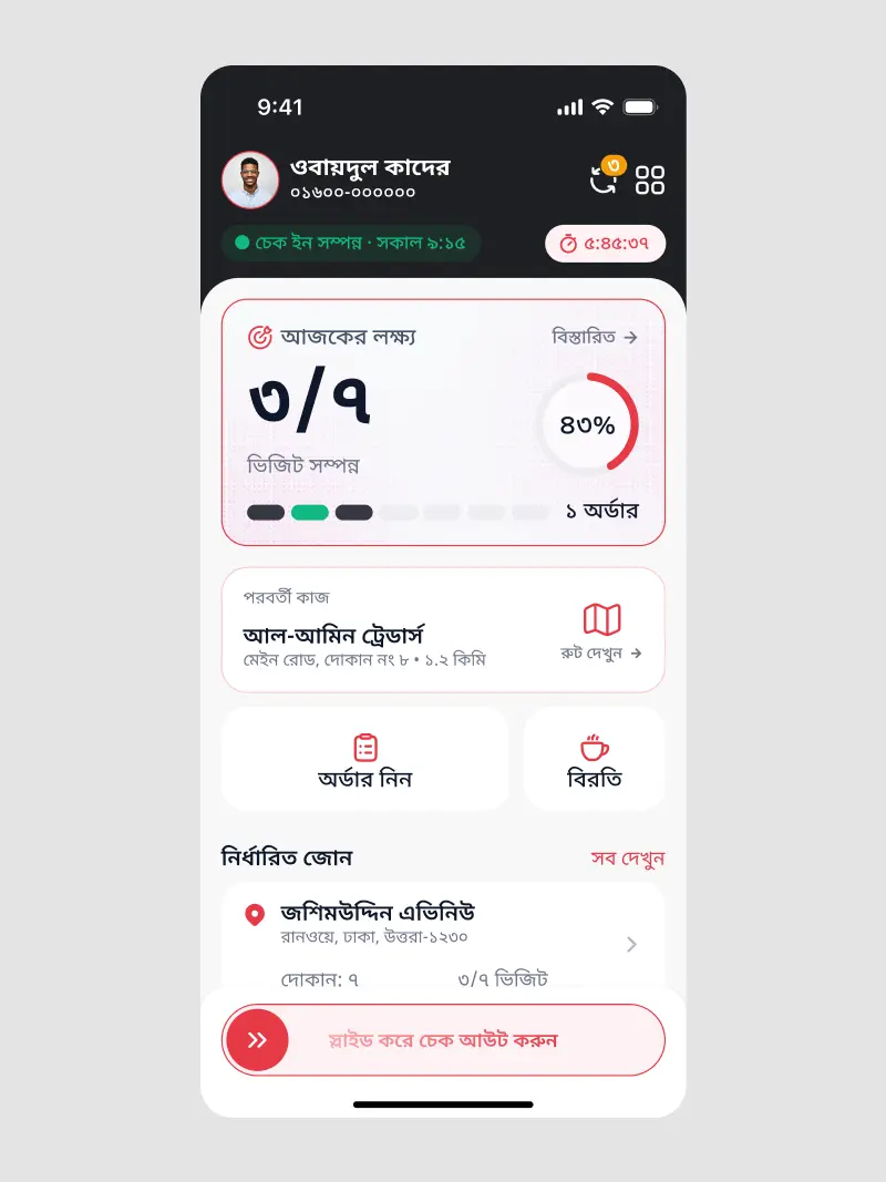
The first redesign solved several hierarchy problems, but another issue remained. It told users what had happened more clearly than what they should do next.
I therefore revisited Home again.
- Persistent check-in status
- Elapsed work time
- Daily target module
- Visit progress
- Order status
- Next shop and distance
- Route and order access
- Break and checkout controls
The goal wasn't to show more information. It was to reduce the time between opening Kothay and knowing what to do.
05 / Progress
Progress needed to mean more than a percentage
The previous experience displayed today's visits and orders as independent counters. That told the user what had happened, but provided little sense of progress toward the day's workload.
The percentage answers “How far have I progressed?” The segmented indicator answers “What happened during those visits?” Together they provide more useful operational meaning.
1 order
- Dark
- Visited
- Green
- Visited + order
- Light
- Remaining
07 / Route Awareness
Turning assigned zones into actionable routes
The old assigned-zone cards primarily communicated location and shop count. The redesigned experience adds operational context: seven shops, three visited, four remaining.
Completed locations become quieter. The next destination receives stronger emphasis. Upcoming locations remain visible without competing with the current task.
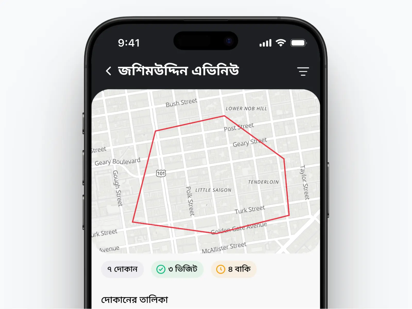
- PastVisitedQuiet confirmation
- CurrentNext destinationStrongest emphasis
- FutureRemaining visitsVisible, secondary
Instead of treating every location equally, the interface prioritises the location most relevant to the user's next decision.
08 / Core Workflow
Connecting the physical visit to the business outcome
- Visit
- Outcome
- Products
- Quantity
- Notes
- Complete Visit
A shop visit is one of the highest-frequency workflows in Kothay. The redesign treats the physical visit and its business result as one continuous interaction.
When an order is taken, products and quantities can be added without leaving the visit context. This avoids forcing the user to think in terms of separate software modules. The workflow follows how the activity happens in the real world.
09 / Repeated Actions
Reducing unnecessary input during breaks
Before
Describe the break
After
Choose a reason
The original break interaction relied heavily on a free-text note. For a repeated daily action, that required more input than necessary and produced inconsistent descriptions.
The redesign reduces effort without removing flexibility.
10 / Interaction Design
Not every action deserves the same friction
Frequent · Temporary · Reversible
Take a Break
Less frequent · Ends shift · Consequential
Check Out
Break and checkout are both part of the workday, but they carry different consequences.
Frequent actions should be easy. Consequential actions should require intent.
11 / Completion
Ending the shift should feel conclusive
Checkout is more than a success state. At the end of the shift, users need confidence that the work they recorded throughout the day has been captured.
Instead of simply ending the session, the interface closes the workday with confirmation.
Workday complete
Illustrative UI valuesআজকের কাজ সংরক্ষিত হয়েছে
12 / Reliability
Connectivity is part of the product experience
Today's orders 3 orders haven't synced
Field teams cannot always depend on stable connectivity. The original product exposed Sync Data mainly as a navigation function.
The redesign makes connectivity visible where it matters. Individual orders communicate whether they are synced or waiting, with a direct recovery action.
13 / Localization
Bangla wasn't added after the design. It shaped the design.
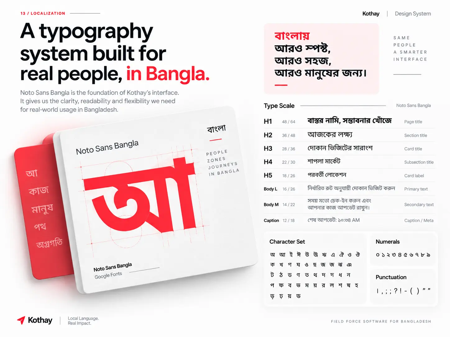
The previous application relied heavily on English. The redesign treats Bangla as the primary working language for the field-force experience.
That decision affected more than copy. It influenced typography, text density, button widths, line breaks, card height, hierarchy, status labels, number presentation and spacing.
- Readable line lengths
- Flexible button widths
- Resilient card heights
- Direct status language
- Clear number hierarchy
Localization wasn't the final layer of the interface. It influenced the layout itself.
14 / Visual System
Designed to survive imperfect conditions
High contrast
Improves recognition under bright conditions.
Large touch targets
Supports use while standing or moving.
Strong states
Separates completed, active and upcoming work.
Operational numbers
Makes progress scannable without close reading.
15 / Transformation
The redesign changed what Home prioritised
Before
- Feature-driven dashboard
- Independent visit and order counters
- Basic assigned zones
- Generic break note
- Sync hidden in navigation
- English-first experience
- Little next-destination guidance
After
- Workday-driven interface
- Target and progress context
- Actionable zone and shop states
- Structured break workflow
- Visible sync status
- Bangla-first UI
- Next task surfaced directly
16 / Measuring Success
What I would validate after release
Success should be measured against operational efficiency rather than visual preference. Until these measurements are collected, the case study describes the UX improvements qualitatively rather than claiming unverified gains.
Time to identify the next shop
Time to record a completed visit
Interactions required to create an order
Accuracy interpreting daily progress
Accidental checkout rate
Ability to identify unsynced orders
Task completion under bright outdoor conditions
17 / Outcome
From product navigation to workday guidance
The redesign shifted Kothay from a feature-driven mobile application toward a workday-driven field operations experience.
Instead of asking field workers to navigate between disconnected functions, the interface keeps their shift state, target, route, next task, visits, orders and sync status connected throughout the day.
The largest improvement was not a new component or visual style. It was changing what the interface prioritised.
Check in. Know the target. See what's next. Visit. Record. Keep moving. Stay synced. Check out.
18 / Reflection
Context changes what good UX means
Kothay changed how I think about interface complexity. Field workers do not necessarily need fewer features. They need less friction between themselves and those features.
A dashboard that feels perfectly understandable while sitting at a desk can become difficult when someone is standing outside a shop, checking a route and thinking about the next customer.
The redesign therefore focused less on simplifying the product and more on simplifying each decision.
The right interface is not the one with the fewest elements. It is the one that makes the next decision easier.
The interface became quieter so the work could become clearer.
Next Case Study
TimoDesk
Designing productivity software that informs teams without feeling like surveillance.
View case study ↗